The 5 Principles of Landing Page Design

In this article

Some websites are just built to hook you in.
Landing pages, in particular, are a type of standalone web page created for the express purpose of getting you—hook, line, and sinker. In fact, when a visitor clicks on an Instagram or Google ad and “lands” on one of these pages, they often leave with an unexpected new email newsletter subscription or a lighter wallet.
Conversion is often the only thing that matters in creating landing pages, and convert they often do. In fact, according to MarketingExperiement’s research, targeting and testing the right landing page formula can increase leads by 638%!
Do landing pages really work that well? Backing up, what is a landing page? How do they work and how are they any different from normal webpages?
To answer those questions, let’s dive a little deeper into the art of the landing page.
What Is a Landing Page?
Admittedly, claiming that building a landing page is all it takes to increase leads by 638% sounds a little crazy. The reality is that beyond an effective landing page design, you also need a solid marketing and A/B testing strategy to hone your landing page even further. (Check out this post for more UX terms every designer should know.)
Related Read: What is UX Design?
But at the core, an effective landing page is necessary before anything else can come into play. The question is: what exactly is a landing page?
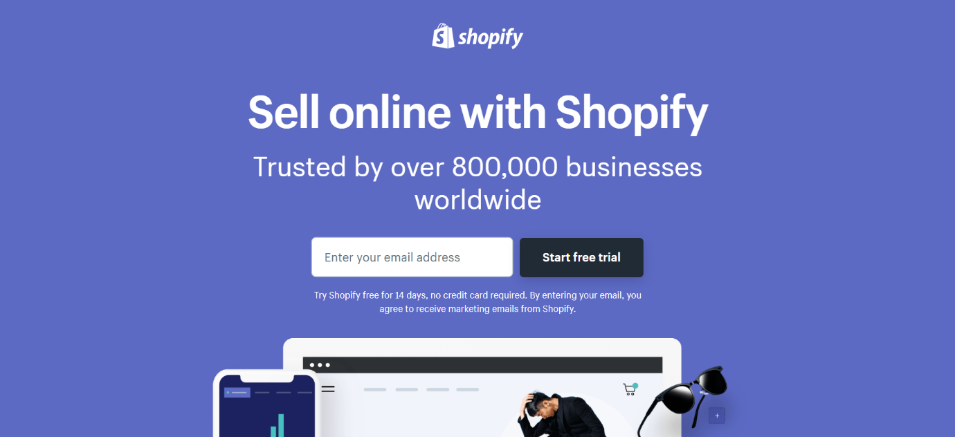
Take a look at this Shopify landing page. Notice any big differences from a typical website?
For one, landing pages often don’t have and don’t need navigation bars. The point of a landing page is, after all, to get your attention. You don’t want to distract people with too many buttons to push or links to click right from the get-go.
In the same vein, Shopify’s landing page for free trials comes with only two call-to-action (CTA) buttons. In fact, there are really only two buttons on the entire page. There’s one at the top, as seen in the image, and one at the bottom of the page. Both say the same thing: “Start free trial”.
This greatly limits what your audience can do on this page—they can scroll or input their email address for a free trial. Coupled with convincing copywriting, it’s not all that difficult to get someone to click, especially if they already have interest in a service like Shopify.
In essence, a landing page really only needs a few simple elements: a headline and a CTA button or link.
Of course, that may not be the world’s most effective landing page—although depending on the context, simplicity might really be key. Regardless, more often than not, you’re going to want to put more thought into engineering the perfect landing page that catches eyes and converts your audience.
Related Read: What Does a UX Designer Do?
Get To Know Other Design Students
Teliah Jackson
UX Designer at AAA
Nicky Arthur
UX Designer at International Baccalaureate
Sinem Ozkaya
UX Designer at Microsoft
The 5 Principles of a Landing Page Design
1. Keep It Simple
Let’s take a look at the landing page below for Chase.
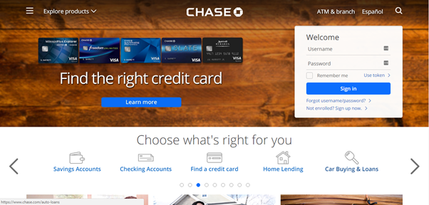
Can you tell what Chase wants you to do on this page? Does it want you to explore its products or sign in? Does it want you to learn more about its credit cards?
At first glance, it’s basically impossible to tell.
That’s not good, because one glance is often all it takes to make or break a deal. Even after the most interesting and engaging Facebook ad, a potential lead landing on this page will be out of there fast simply because they have no idea what Chase is trying to sell them.
The main problem, although not the only one, is that there are simply too many things crammed onto one page. It’s quite clear Chase did not intend to create a pure landing page. In fact, this page looks much more like a homepage than a landing page and that’s a big no-no.
When it comes to landing pages, keep it simple.
A good rule of thumb is to look at the attention ratio on your page—in other words, the ratio of unnecessary clickable items to the items that can and should be clicked. Landing page platform Unbounce actually recommends sticking to an attention ratio that is 1:1. For every item, whether it’s text or an image or a block of items, there should only be one button. Of course, that’s only a general rule.
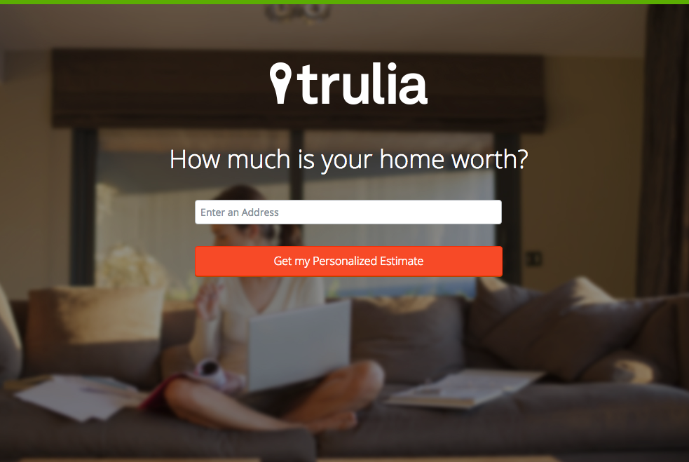
A good example of how important it is to keep your landing page simple is Trulia’s old landing page. The first thing you see on this page is the company name and then a question: “How much is your home worth?” This clues you in on what Trulia is: a website to buy, rent, and sell homes (although this particular landing page is specifically geared toward sellers).
A single field and a single button is all it takes.
This page is not only clear on what it wants potential leads to do, it’s mysterious enough to get you interested and excited. Using a question also helps encourage people to get curious and find out for themselves: how much is my home worth?
2. Limit Your CTAs
If you recall Chase’s landing page, you’ll realize something else that the company did incorrectly: the landing page has multiple CTAs.
Are you meant to sign up or learn more about Chase? It’s hard to tell when there’s more than one clear button, both of which look exactly the same yet do quite different things. This will negatively affect your conversion simply because your lead doesn’t know what to do to convert!
Every button on your page should be the same call to action, whether it’s asking your lead to sign up for something, input their email, or learn more about your product. In fact, having a single button might be all it takes, much like in Trulia’s example.
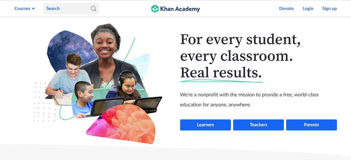
Of course, it’s not a hard and fast rule. In reality, it’s much more common to see multiple buttons, perhaps because a company wants to offer two similar services, or they might be appealing to multiple markets such as with Khan Academy’s landing page.
That said, Khan Academy’s landing page is clear about who should click on which button. And on mobile, these buttons smartly collapse into a single button that says “Start here”.
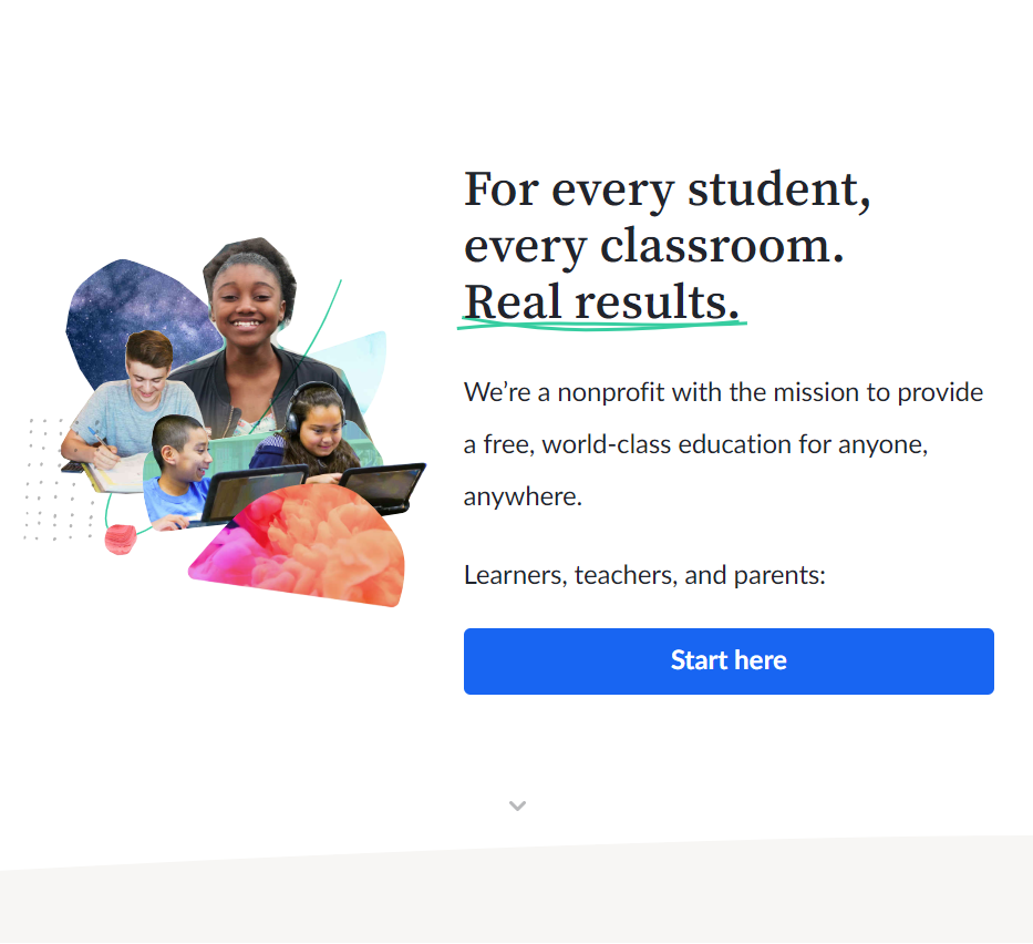
Clicking the button leads you to the bottom of the page, where there are buttons denoting the same three groups of people: learners, teachers, and parents. And there’s even a button to get you back to the top of the page. (This attention to detail in terms of the way that these CTAs change on mobile and desktop is vital so you can keep your audience, no matter where it’s coming from.)
Scrolling through the page, there are multiple CTAs. The difference between the way Khan Academy’s page employs CTAs versus others is that they essentially link to the same thing as the buttons on the top of the page. Each button following the initial three is all about having “Learners, start here” and “Teachers, start here”.
There is a button that doesn’t relate to the three groups, but it does link directly to the text above it.

In the end, Khan Academy’s landing page is clear, responsive, and simple despite having multiple buttons with multiple CTAs. They break up the CTAs with text and images, making sure that only a maximum of three buttons are ever on your screen at the same time, and that’s a good way to include multiple CTAs if they really are necessary.
Of course, at the end of the day, having a single CTA or type of CTA will still make your landing page more effective.
3. Visual Hierarchy
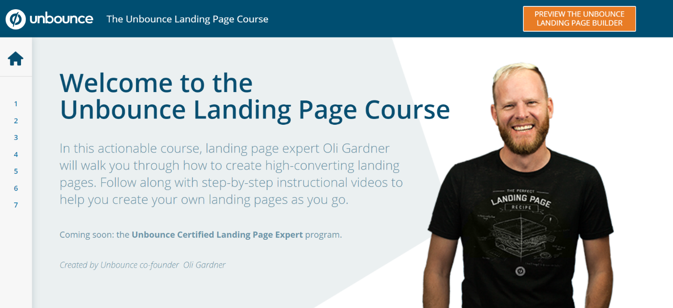
What’s the first thing your eyes are drawn to when you look at Unbounce’s landing page for its (meta!) landing page course?
Most people would have seen the title first before anything else—and there’s a good reason for that. A lot of us are lazy readers—we scan a page and look for anything that pops out. If nothing does, then it’s not an interesting page and we’ll probably close it right away.
That’s why visual hierarchy is important. You need to engineer your landing page in a way that makes the highest item within your visual hierarchy the most interesting. Draw your lead’s attention before you lay any extra information on them. This is what makes Unbounce’s landing page here so effective.
They know exactly how to position the items on their page in a way that packs a lot of punch. It’s somewhat minimalistic despite breaking the 1:1 attention ratio rule. They achieve this by carefully examining the way people read or scan websites and making full use of it.
In fact, this page in particular makes use of the F-scan pattern that people often use to look through text-heavy websites.
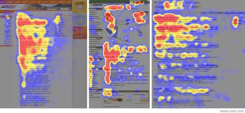
Researchers at Nielsen Norman Group used gaze-tracking to demonstrate that when it comes to text-heavy websites, readers will often go from top to bottom, scanning across bigger and more important items in a sort of F pattern with many stems.
Another interesting observation is that the scan patterns often drop off two or three words into the line. Generally, this means your readers are really only going to be interested in the first few words of the first few sentences in your landing page. Unbounce leverages this by making it immediately clear exactly what this landing page is all about in the biggest heading and then uses buzzwords like “actionable” and “expert” in the first few words of the subtitle. This hooks us in while also painting an excellent picture of what this page is all about.
Other than the F-scan pattern, there are also L-scan, E-scan, and Z-scan patterns, which are more often used with image-heavy pages. Keeping in mind how the typical internet user looks through your webpage is a good way to control how they react to your CTA.
One specific tip for controlling visual hierarchy is also to make use of the gaze.
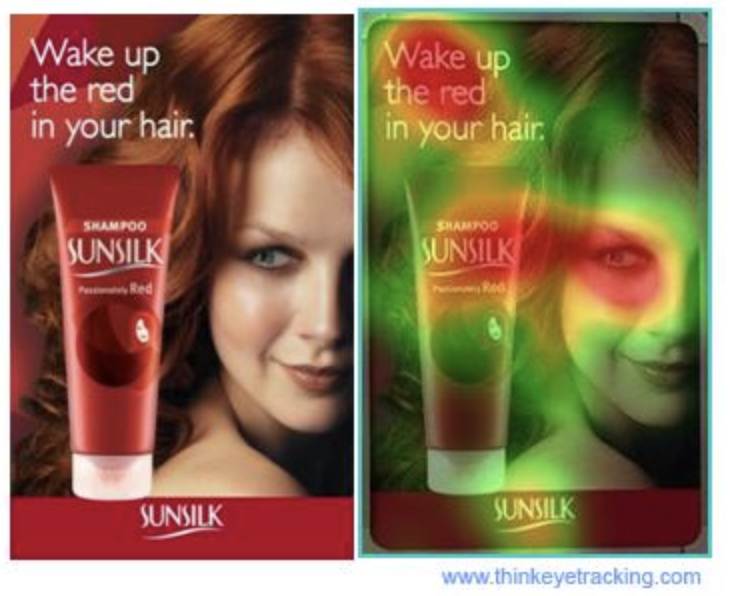
In this study, it’s clear that when we see an image like this, with a person looking in a particular direction, our eyes tend to follow her gaze. This helps to draw attention to certain elements, in this case the bottle of shampoo.
Another good way to control your reader’s attention is to envelop important elements. This is commonly done with forms, putting them at the front and center of your landing page design.
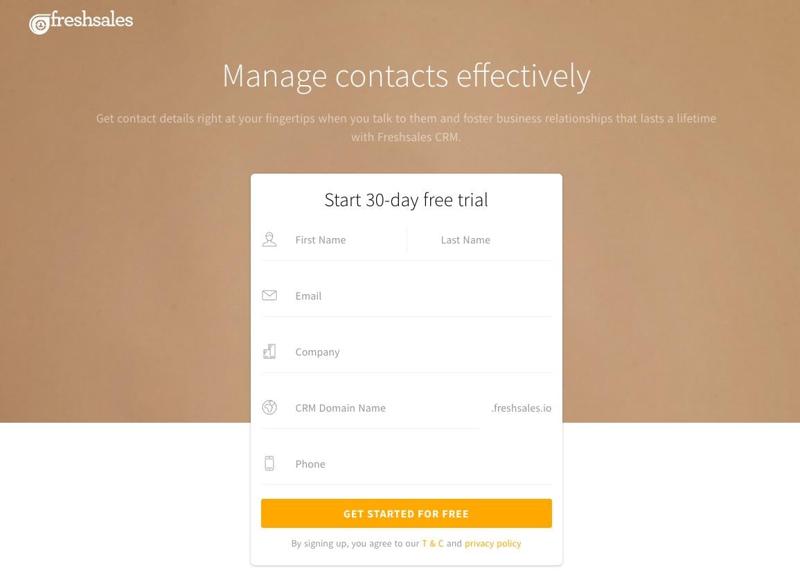
Freshsales does this particularly well by making the colors of their lead capture form contrast with the background. It makes the form pop and it makes it clear that’s what the CTA is. In addition, simply blocking these elements together helps to give structure to the page and encourages leads to look into this free trial.
4. Put the User first
Piggybacking on the previous points, it’s of absolute importance to keep your users in mind when designing your landing page. A beautiful landing page with moving elements and interesting visuals might turn some heads, but when it comes to converting, there are some tried and true tips and tricks to be aware of.
For one, make sure your website is responsive. That means no matter what device your user is accessing your landing page on, it looks perfect and the elements you’re using to get their attention and convert them are positioned well.
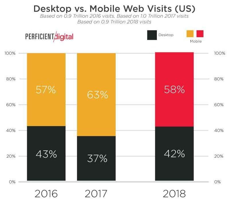
In the last few years, mobile phones have progressed by leaps and bounds and now a majority of internet users access the internet purely via their phones. That makes responsive landing pages even more of a priority.
It’s not just that, though.
It can be tempting to break the mold and deliver a landing page experience unlike anything anyone has ever seen, whether that’s by rethinking the way you navigate a page or redesigning the very structure of a landing page.
Here’s an example of a rather innovative landing page.

Made for Landbot.io, a chatbot service, this landing page is actually a chatbot! That’s a really creative idea and something that would pique your interest immediately. But let’s face it, if this was your bank or a local retail shop, it probably wouldn’t make as much sense.
Creativity and innovation have their place. But creativity for the sake of creativity might end up steering your landing page in the wrong direction. It could confuse your readers about what your landing page is actually selling, and worst of all, readers may not even realize that they’re on a landing page!
Another important thing to think about when putting your user first is legibility.
No amount of writing prowess will prevent your users from leaving your page if they can’t read the copy. The case below demonstrates the problem with illegible web design. The title “The Perfect Touch” is black on a grey background, making it difficult to read. This greatly affects the impact a good title can make.
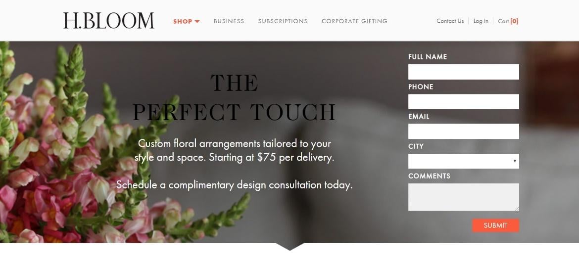
In fact, here it almost seems like the white subtitle is the most important bit of the page when it shouldn’t be. Illegibility can throw off the visual hierarchy on an otherwise excellent landing page. This is a growing problem, especially since it’s increasingly tempting to layer your copy over a nice accompanying image, a common web design tactic.
5. Be Eye-Catching
This might seem a little counterintuitive in light of the point we just discussed, but it’s important to create a landing page that stands out.
Today, landing pages are used in all industries and businesses. To compete, a landing page needs to really jump out, whether in terms of aesthetic or strong copy.
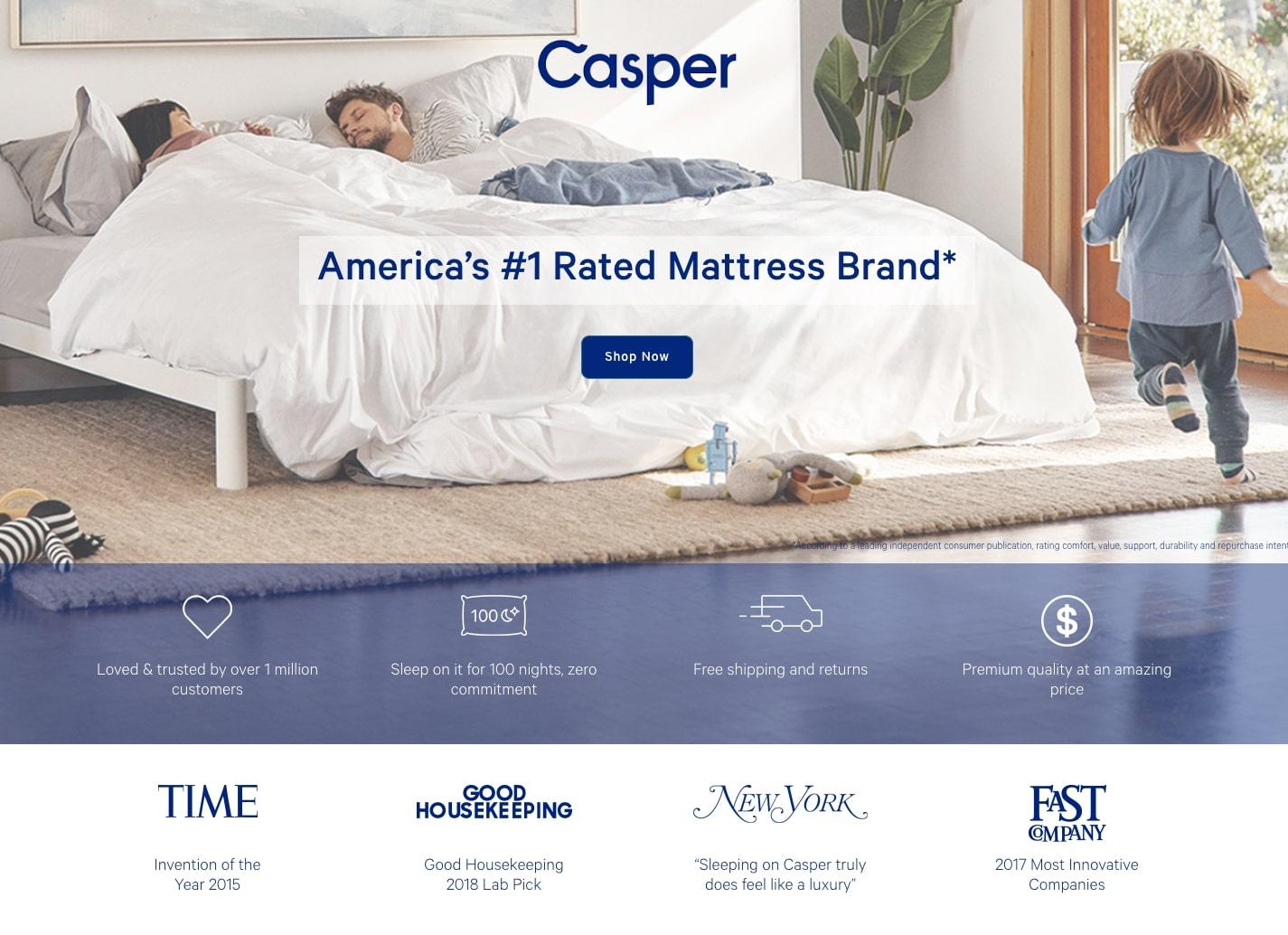
In the case of Casper, clear and concise copy with bullet point features and a sprinkling of customer testimonials helps to create an effective landing page. Even without ground-breaking design, a simple image that nicely enforces the core concept of Casper as well as clear design can easily push a landing page to the next level.
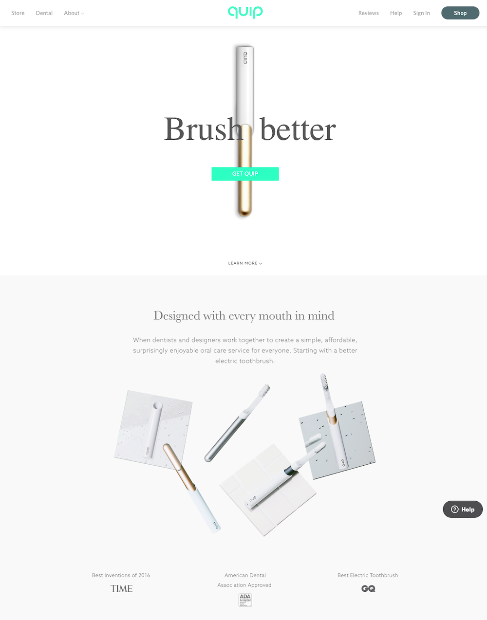
Simple minimalism is also on the rise, and for good reason, as can be seen with Quip’s landing page. It’s clear, simple, and clean, making it easy to read and understand. In contrast to typically text-heavy landing pages, having an almost bare landing page like this could help you stand out.
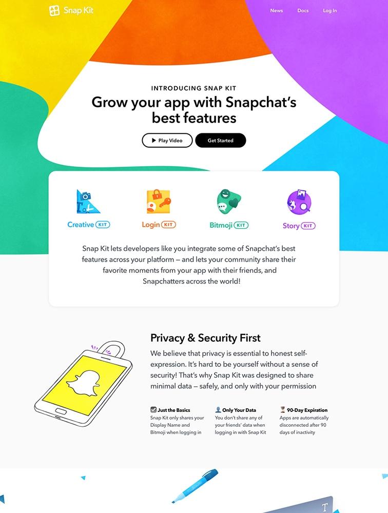
On the flip side, a colorful and youthful look like the one that Snapchat is going for here can also attract some eyes. Of course, it’s essential to make sure that your landing page design actually suits the audience. A site selling something meant for an older audience might not fair so well with such a colorful theme.
There are plenty of other tactics a designer can employ to create a unique and effective landing page, whether that’s making interesting animations or doing something unexpected. The main thing to think about is what your audience wants to see and what information you’re hoping to gain.
Since you’re here…
Are you a future UX designer? Enroll in our UI/UX Bootcamp and join over 10,000 students who have successfully changed careers with us. Want to get wireframing right this second? Check out our free UX learning path today.


