Accessibility in Design: Best Practices, Case Studies, and Useful Tips

In this article

Imagine you’re riding the New York City Subway. You just want to get from one side of the city to the other.
But as soon as you enter the station, you’re confronted with a confusing maze of physical barriers. The obstacles mean that you’ll need to ask for help at nearly every turn.
Worst of all, a lot of these problems could have been avoided through better planning and design. Still feel like going out?
Unfortunately, this is the daily reality faced by people with disabilities when trying to access systems that haven’t been designed for their needs.
However, in the past few decades, there has been a worldwide movement toward more accessible design practices. In 1990, the passing of the Americans with Disabilities Act made accessibility a national priority in the U.S. And many countries ratified the United Nations Convention on the Rights of Persons with Disabilities in 2006.
Since one of the key goals of UX design is to create user-friendly products, accessible design is highly relevant to UX professionals. This important topic has been discussed by design experts in TED Talks, on social media, and more.
Here, we’ll explore what a UX specialist (or aspiring UX specialist) needs to know about accessibility in design. You’ll learn who benefits from accessible design, how to implement accessibility best practices, and which companies are excelling in this area (more about UX design here).
Who Benefits From Accessibility in Design?
Many different groups can benefit from design adaptations, and each has a unique set of needs. Below, we’ll discuss several groups that are likely to encounter accessibility challenges.
Elderly People
Your needs change as you grow older, and a product that is usable for a young person might not be usable for an older one.
Don Norman, the 83-year-old author of “The Design of Everyday Things” and a former vice president at Apple, wrote about this in a 2019 article for Fast Company. As he grew older, he began noticing problems with the design of certain products:
“Everyday household goods require knives and pliers to open… Companies insist on printing critical instructions in tiny fonts with very low contrast… and when companies do design things specifically for the elderly, they tend to be ugly devices that shout out to the world ‘I’m old and can’t function!’”
When designing products for elderly people, it helps to keep in mind that they may face the following challenges:
Decreased Vision
Vision naturally deteriorates as you age. Approximately one person in three has some form of vision-reducing eye disease by the age of 65.
Limited Hearing
As people grow older, they naturally lose their ability to hear high-pitched sounds. They also may begin to lose their hearing in general.
According to the National Institute on Deafness and Other Communication Disorders, approximately one in three people in the U.S. between the ages of 65 and 74 has hearing loss, and nearly half of those over 75 have difficulty hearing.
Lessened Physical Strength
Most people experience a gradual decline in muscle strength as they age. Changes in muscle mass can begin as early as ages 30-40.
Blind People
The World Health Organization estimates that 1.3 billion people around the world live with some form of visual impairment. Many people with visual impairments use the following adaptive technologies:
Screen Readers
Screen readers help blind people use a computer by “speaking” the words on a webpage out loud.
Screen Magnification Systems
For people with milder forms of vision loss, screen magnification systems can be helpful. This technology allows computer users to magnify the area around their cursor as they navigate a webpage.

Braille Translators
Braille translator software converts digital documents into Braille files, which can then be printed or read on a Braille display device.
Deaf People
Over 5% of the world’s population has disabling hearing loss, and this number is expected to double by 2050.
Some partially deaf people use these adaptive technologies, among others, to improve their hearing ability:
Hearing Aids
Some people with hearing loss can partially regain their hearing using hearing aids. Hearing aids amplify sounds in the environment to make them easier to hear.
Cochlear Implants
Cochlear implants are made up of an external component and an internal (surgically implanted) component. The implant directly stimulates the auditory nerve to help deaf people recognize sounds and speech.
Others People With Physical Disabilities
People with other types of physical disabilities may also need adaptive technologies to help them use certain products.
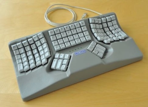
For example, some people with limited mobility in their hands are unable to use a mouse. They may need to navigate websites using a regular keyboard, or a special adaptive keyboard.

Best Practices in Accessible Design
We’ve now discussed a few groups that have accessibility needs, and the technologies they use to meet those needs. So how can you, as a UX designer, make your products more accessible?
Below, we’ll go over some industry best practices for accessible design.
Accessible Design for Websites and Mobile Apps
The World Wide Web Consortium (W3C) publishes a guide to accessible web design. Here are some of the highlights:
Image ALT Text
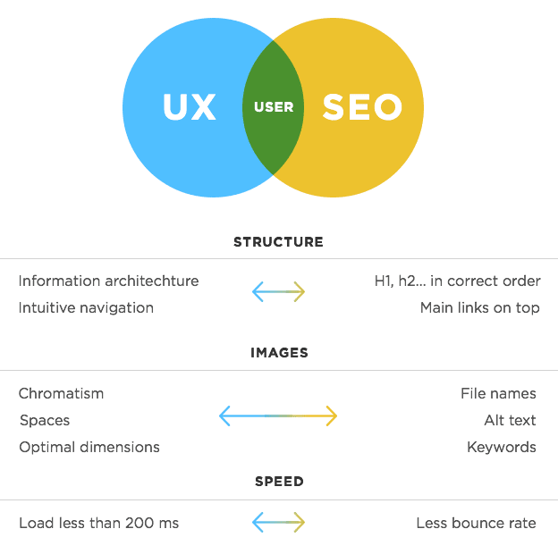
You might have heard about the benefits of ALT text for search engine optimization, but did you know it’s also good for accessibility?
Adding ALT text to your HTML code allows blind people using screen readers to understand what the images on your site represent.
Below is an example of ALT text used on the Springboard blog.
Here is the image:

And here is the ALT text displayed in the code editor:

Closed Captioning and Transcripts
If you have audio or video content on your website, providing transcripts or closed captioning will help people with hearing loss.
Video transcripts can be created by hand or via software. The W3C links to a list of recommended transcription services.

Keyboard-Only Optimization
To optimize your website for people who can’t use a mouse, the web accessibility team at UC Berkeley recommends that you:
- Try to navigate through your website using only your keyboard, and see if you run into any problems.
- Make sure that the most frequently used pages on your website are the easiest to get to.
- Provide a link at the top of web pages allowing users to quickly skip to the main content.
Color Contrast and Text Size
To make your website usable for the elderly, as well as people with vision loss or color blindness, you should prioritize readable fonts with high color contrast.
The W3C offers some helpful guidelines for using contrast in your website or app design. You can try this color contrast checker to see how your color scheme measures up.


Accessible Design for Products
You can also use the principles of accessible design when creating a physical product. Here are a few tips:
Keep Physical Ability in Mind
Whenever possible, products should be designed to meet the needs of people with differing physical abilities. In the built environment, one example of accessible design would be “curb cuts,” or ramps for wheelchair users.

Use Large and Clear Fonts
Using readable fonts is just as important in product design as it is in web design.
Make sure to use large fonts with high color contrast for your product instructions. Depending on what your product is, it may sometimes make sense to include braille text.

Make Accessibility Aesthetic
In Don Norman’s article, he mentions the embarrassment elderly people often feel when using products (such as walkers or canes) that have clearly been designed for function over form.
No one wants to feel like they stand out; the elderly and people with disabilities are no exception. For design to be truly accessible, it must also be inclusive.
Products for people with disabilities should be designed with the same aesthetic care as any other type of product.
Get To Know Other Design Students
Jeffrey Surban
UX Designer at Citi
Erich Schulz
Product Designer at Disney Parks, Experiences And Products
Reyna Martinez
Associate UX Designer at ServiceMax
Case Studies: Successful Applications of Accessibility in Design
Although there is still more to be done, many companies have made a lot of progress in the field of accessibility. Here are some inspirational examples of design accessibility done right:
PriestmanGoode’s Scooter for Life
The Scooter for Life is a standout example of accessible product design.
Commissioned for the Design Museum in London, PriestmanGoode’s scooter was designed to be attractive and innovative, countering the stigma of reduced mobility in old age.
The design was modeled after scooters used by children and young adults, showing mobility as a lifelong journey.

Apple’s Business Case for Accessibility
Over Apple’s history, there have been several moments when the company went out of its way to improve product accessibility. Each time, it turned out to be a wise decision from both a business and UX standpoint.
One instance happened in the early 2000s, when the California State University system was unable to take advantage of Apple’s iTunes U educational program. The university could not use the program because it was not fully accessible for blind students. After listening to their concerns, Apple took steps to fix the issue, and the university was able to implement the program.
A second example occurred when developing the iPhone. Apple’s team realized that using a touchscreen device might be difficult for blind customers, and developed the VoiceOver screen reader in response. The screen reader was popular and earned Apple a commendation from the National Federation of the Blind.
You should now know more about accessibility: who needs it, why it’s important, and how to achieve it.
Ultimately, accessible design benefits everyone. In his article, Don Norman points out that there are times when anyone might have trouble reading low-contrast text—for example, in dim light, or when experiencing glare from the sun. The more accessible a product is, the more usable it will be for everyone.
Since you’re here…
Are you a future UX designer? Enroll in our UI/UX Bootcamp and join over 10,000 students who have successfully changed careers with us. Want to get wireframing right this second? Check out our free UX learning path today.


