Springboard Tutorial: How to Become a Data Visualization Pro in Tableau

As a data analyst, your job is to help stakeholders derive meaningful insights from data.
Although many data analysts use math, statistics, and probability on a daily basis, data analysis is actually both an art and a science. By carefully choosing the colors, labels, and format of visualization, you can lead people to notice outliers and patterns.
Are you looking for information on how to become a data analyst? Check our comprehensive career guide right here.
What is Tableau?
Tableau is a visual analytics and business intelligence platform that helps people synthesize trends across disparate data. It’s a software package that imports all sizes and types of data, using R, SQL, or Python, and can quickly analyze those queries while producing visually appealing dashboards and worksheets.
In the example below, we can see in a few seconds that lifespan, education, and income are increasing in Brazil over time because the years are moving chronologically from darker to lighter colors.
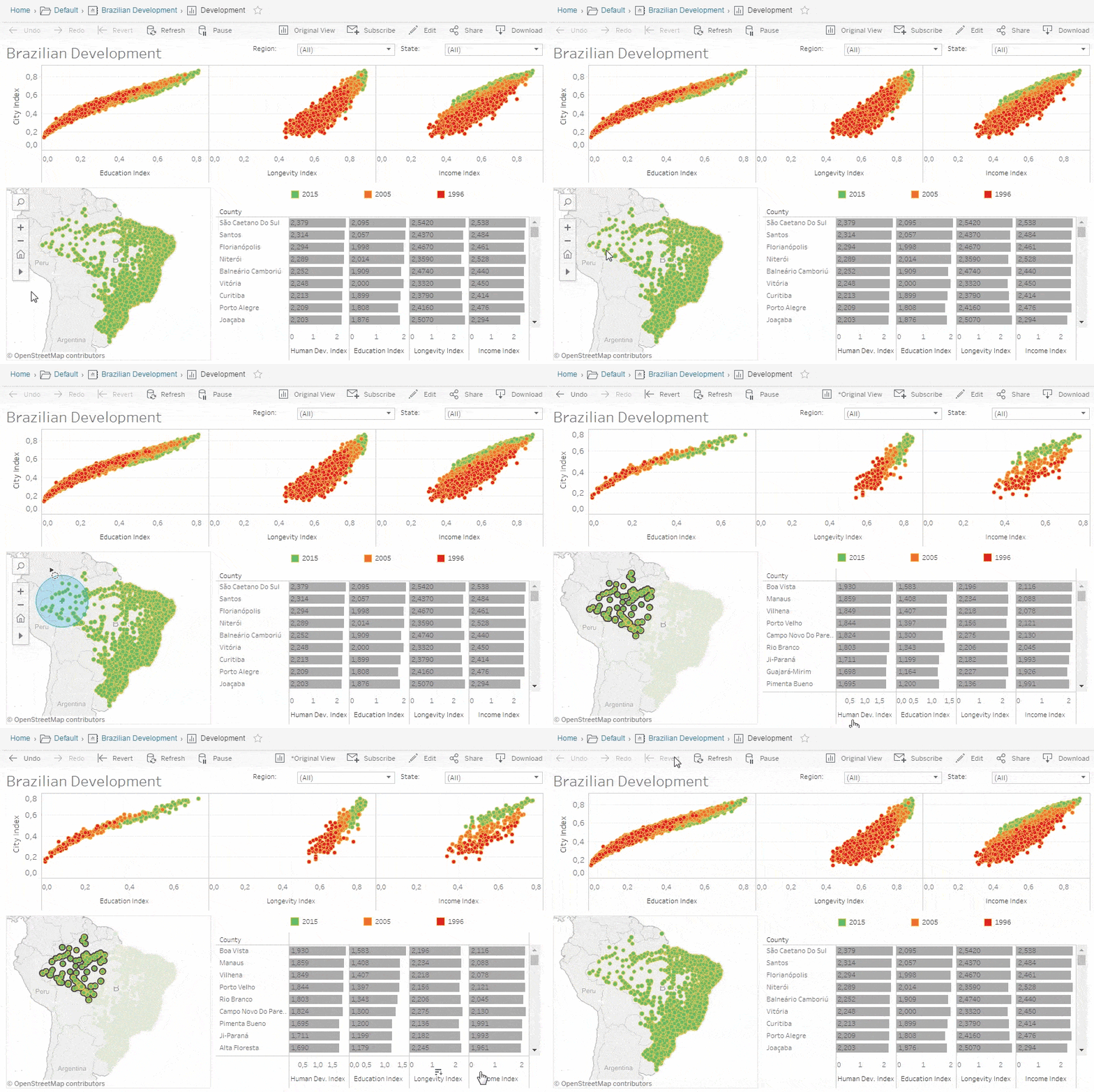
Compared to other data visualization tools like PowerBI, ChartBlocks, Zoho Analytics, and Google Charts, Tableau stands out for its ease of use, attractive interface, direct data connections, and varied publication options making your data analytics project more comprehensible.
Tableau offers a number of different technology products, with Tableau Desktop, Tableau Public (free version), and Tableau Online all providing visualization options.
Getting started with Tableau
-
Install the software and explore the Tableau workspace
-
Connect to a data source
-
Create a view
-
Create a dashboard
-
Build the story
Below you’ll find a step-by-step guide for exploring the Tableau product suite.
Step 1. Install the software and explore the Tableau workspace.
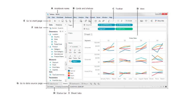
Take a look around and familiarize yourself with how to open a new workbook. You will notice a data pane and the ability to add different marks, which change colors, sizes, labels, details, and more.
There are also different menus to choose from:
- File menu – Set language, paste sheet, and export packaged worksheets
- Data menu – Explore different data sources, refresh extracts, and edit the relationships of data fields
- Worksheet menu – Show summary of data and run updates
- Dashboard menu – Set format, link to external URLs, and export images
- Story menu – Set layout of colors and sections of the story
- Analysis menu – Show forecasts and trend lines and create calculated fields
- Map menu – Hide and show map layers and apply geocoding
- Format menu – Create borders, titles, captions, cell size, and themes
- Server menu – Publish workbook and data source and create user filters
Step 2. Connect to a data source.
With Tableau, you can import data from Excel, SQL, or a cloud database like Google Analytics and Amazon Redshift.
Step 3. Create a view.
Here are some basic terms that are important to understand.
- Dimensions – Dimensions are qualitative data like names and dates that help to organize / group measures
- Measures – Measures are quantitative data, like sales, distance, or size
- Aggregation – Aggregation occurs when measures are combined or added up to make a sum
To create a view, start with a new worksheet and drag different dimensions and measures to the rows and columns section, which will allow you to define the x and y axes.
In the “Show Me” data pane, you can choose the type of graph or chart you’d like to produce.
You can then refine the view by adding labels, filters, and colors.
Step 4. Create a dashboard
With a dashboard, you can drag multiple sheets into a workspace and then select size, positioning, background, and other details. “Adding objects” allows you to embed web pages, buttons, text boxes, and extensions. Once you are finished, you can switch from edit to presentation mode to view the final product.
Here are some tips for making your dashboard stand out:
- Know your purpose and audience
- Leverage the most-viewed spot (the upper-left of the web page)
- Author at your final display size
- Limit the number of views (choose 2-3 views and only meaningful colors)
- Add interactivity to encourage exploration (e.g. filters and highlighting)
Step 5. Build the story
Tableau has a story feature, which allows you to bring in a sequence of different sheets to communicate your findings. You can then add captions to call out key themes and results.
Once you publish a workbook, users can begin interacting with the content and asking questions.
Get To Know Other Data Analytics Students
Sarah Savage
Content Data Analyst at EdX
Rahil Jetly
Sales Operations Manager at Springboard
Sylwia Padiasek
Senior Research Analyst at Gro Intelligence
Most common pie charts in Tableau
Data analysts use charts, tables, graphs, maps, infographics, and dashboards to represent data in different ways.
In statistics, one of the first topics you’ll cover is how to decide what chart/graph is right for you. Options include:
- Bar charts – Useful for comparing the relative size of multiple categories
- Line charts – Useful for showing trends over time
- Maps – Useful for locating people or events in different geographic areas
- Density maps – Useful for identifying patterns and areas of greatest concentration
- Scatter plots – Useful for illustrating relationships between different variables
- Gantt charts – Useful for planning a project and determining the schedule of different activities
- Treemaps and pie charts – Useful for breaking a larger quantity or sum into smaller constituent parts
The right visualization tool for your business problems depends on the questions you want to answer, the properties (characteristics) of the data in question, and the goal that you’re trying to achieve – the audience you’re communicating to and what you expect them to do with the results.
Here is a brief tutorial on how to build a pie chart.
For a simple pie chart, you can use one dimension and one measure. For example, in this visual, you can see the dimension named “region” paired with the measure named “profit.”
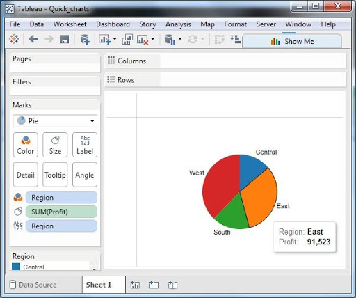
Depending on the complexity, it’s also possible to create multiple layers with a drill-down pie chart—in this case, showing sub-categories and manufacturers of different products.
Examples of Tableau tutorials
To expand your Tableau skills, you can address common business problems through tutorials like:
- What is leading to the profit loss of a retail store?
Learn how to do a deep-dive into geographies with unprofitable products. You will create a bar chart, map view, and interactive dashboard to drill down into potential root causes of the problem.
- Which category do different types of household items belong to?
Learn how to create groups, hierarchies, and sets and sort data by data source order, alphabetical order or other fields.
- Which arts discipline do most applicants to the Iowa Arts Council Grants apply from?
Create a map to show where the grants go and use stacked bar charts to classify applicants by discipline and institution.
- What is the average spend per category of a Chase credit card?
Examine credit card transaction data through a box and whisker plot, bar chart, pie chart, and packed bubbles chart, comparing categories like education, travel, bills and utilities, food and dining, and health and wellness.
Data is a powerful tool, but only if you can understand it and help others draw useful conclusions that positively impact business outcomes. Explore Springboard’s Data Analytics Career Track for a comprehensive view on structured thinking, business analysis, SQL, Python, and data visualization through tools like Tableau. You’ll become a data wizard in no time!
Related Read: Top 13 Best Data Visualization Courses
Additional Tableau dashboards
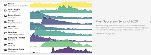
Check out the most popular songs of last year.
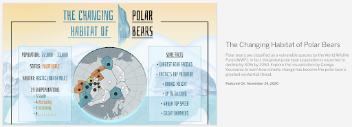
Make a map of the changing habitats of polar bears.
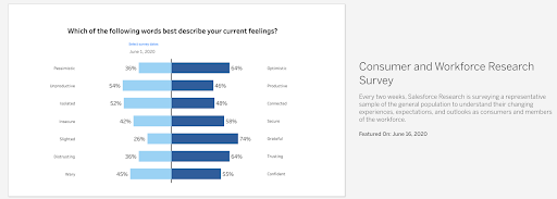
Understand how workers felt during the pandemic in summer 2020.
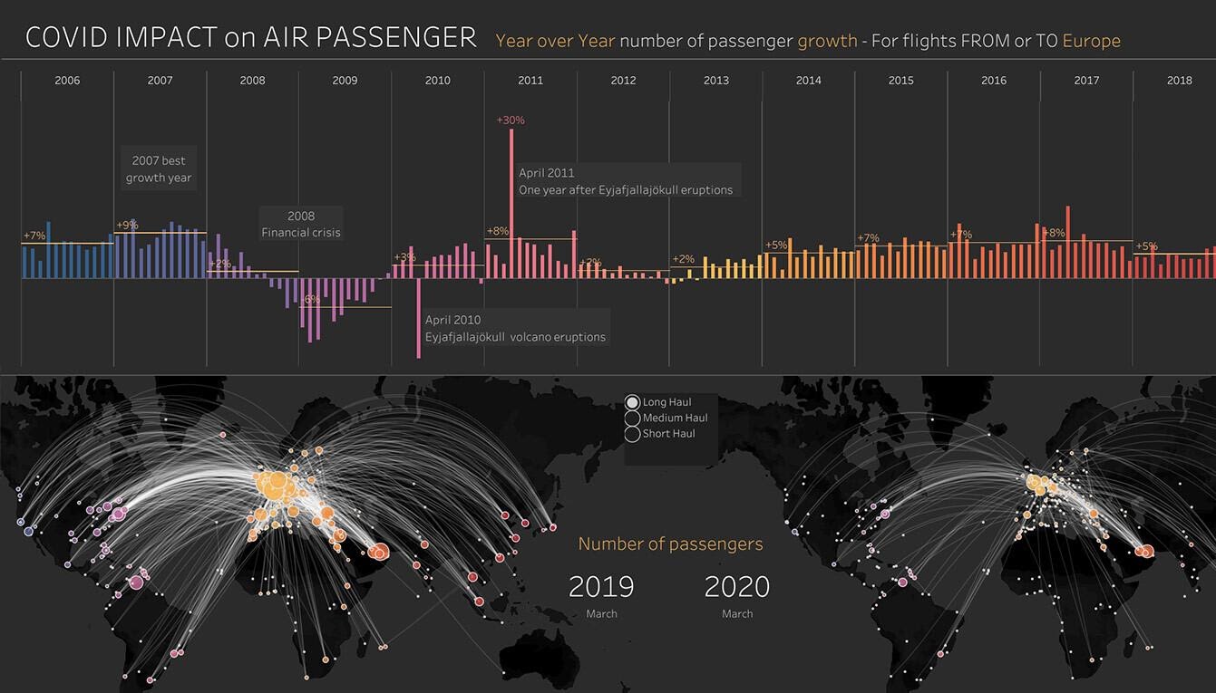
Visualize COVID-19’s impact on the transportation sector.
Since you’re here…
Interested in a career in data analytics? You will be after scanning this data analytics salary guide. When you’re serious about getting a job, look into our 40-hour Intro to Data Analytics Course for total beginners, or our mentor-led Data Analytics Bootcamp—there’s a job guarantee.


